Data Exploration using FRED
Student Name:
Institutional Affiliation:
Instructor:
Course Title:
Submission Date:
There are a total of five figures in the appendix section, where each of these graphs depict the trends of various variables, with the first four being in direct relationship with labor economics while the fifth one considers the rate of inflation as estimated by investors in the market and what the treasury records in the long run. In some instances, there was a need for graph modification to include specific variables relevant to the study, which made them as resourceful as possible. In some cases, there were instances where frequencies had to be adjusted. The entire assignment data and graphs are to simplify the nature of the US labor market over time; indicating whether there is improvement, stagnation or decline in the current trends.
According to the availed excel data, civilian unemployment rate hit the ceilings from March 1982 when there was a record of 9.0; however, it worsened with time before attaining a peak rate in November that year. It is, therefore, 1982 that had the highest values of civilian unemployment with its months of November and December closing with a percentage recording of 10.8. On average upon comparing annual civilian unemployment rate, the year 1982 stood out with a value of 9.7; only the years 1983 and 2010 were a mark closer to the set rate since they stood at 9.6 each. In history, such percentages imply a high level of inefficiency in the country.
Figure 1 display the total number of household individuals in employment as revealed by various firms and companies or entities. The only demerit in this method could be on determining the accurate number of people employed since there is a risk of double entry for those having dual or more jobs. That aside, the figure displays the information on employment variation over the past ten years. 2009 and some part of early 2010 indicate the country was in an inefficient state with employment rate hitting negatives, but that changed from 2011 employment figures. 2018 through the beginning of this year are showing positive trends, and there is a possibility that the labor market will extend further with increased employment opportunities.
Figure 2 displays information comparing sectors’ employee absorption rate in the labor market. I chose to go with four variables; Construction, Financial Activities, Retail Trade as well as Professional and Business Services. The graph provides that retail trade has been the major contributor in the labor market since 1940 before Professional and Business Services took over in the late 1990s to date. The two remain the primary job creators and display the highest level of absorption as the gap between them, and the rest confirms. As for Construction and Financial Activities, their distinction in job provision became apparent in the mid-1970s when Financial Activities became famous, however, after 2010, Construction looked determined to attain the same level.
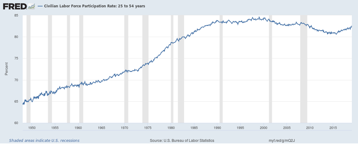
Figure 3 exploits the civilian labor force participation by comparing gender since 1948 to date. Earlier in the graph there is a wide gap between men and women’s level of involvement in the labor market. The gap dwindled though, with the present percentage displaying a better representation of every gender, however, there is still more work to be done to ensure equality in the national employment opportunities with the future being bright as the trends depicts. Figure 4 shows the inflation rate in the economy as projected by the investors and the actual recording by the Treasury. The figures are moving in the same direction, with the late reports from the Treasury indicating lower rates contrary to investors’ expectations, which remains a good trend for the economy. Every economy must work towards tapping maximum contribution from its potential and active labor force falling between age 25 and 54. Figure 5 confirms that in the past, from 1948 to mid-1970s the participation rate of this group was low, but with time there is expansion. Despite deteriorated records between 2010 and 2014, the levels have remained stable an indication of increased production in the country.
Reference
Appendix
Figure 1: The Total Number of People in Employment as reported by Companies
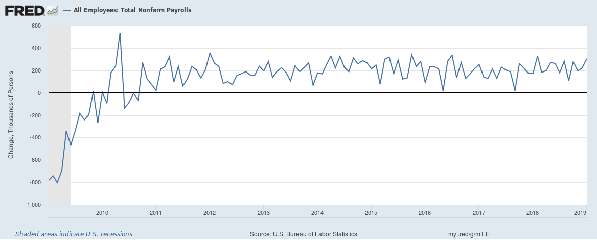
Figure 2: The Number of Jobs in Four Sectors
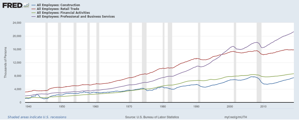
Figure 3: Civilian Labour Force Participation: Women and Men
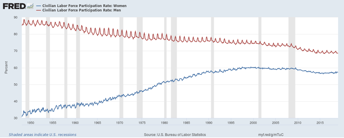
Figure 4: Comparing Breakeven and Treasury Inflation Rates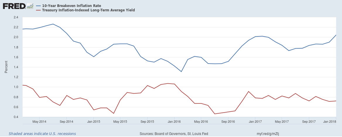
Figure 5: Civilian Labor Force Participation Rate: 25 to 54 years